|
Urban land values have increased dramatically and Asheville is no exception. The assessed value on our home went up 75% resulting in a 56% increase in taxes in a single year. According to the Citizen Times article, average increases were about 40% in our neighborhood and slightly lower across the city. We are fortunate enough to be able to pay the increased taxes without much sacrifice, but what about those that can't? What about home owners that are paycheck to paycheck (as I was prior to marriage)? How will increased taxes impact them?
I created the GIF below to show why it is a critical time to donate to organizations that help such families. This GIF was presented to the Asheville Area Habitat for Humanity Board of Trustees and shows lands values expressed in price per acre. The national average value of urban land is around $500,000 per acre and Asheville land values exceed this in some neighborhoods. The lot next to us sold for $116,000, but is only 0.14 acres making its value around $828,000 per acre. With the city reducing the minimum developable lot size, this is becoming more common. Habitat for Humanity buys land and builds new housing stock and relies on a supply of available land. Available inexpensive urban land is not a problem in many large cities like Charlotte, Houston, or Detroit, but is a considerable obstacle in the mountains. Prior to this increase in value, Habitat would buy land in the neighborhood of $40,000 per 1/8th acre building lot. In the color ramp used in the maps below, think of the red areas as places Habitat for Humanity can no longer afford to build homes. Watch the loop several times and note the assessment years of 2006, 2013, and 2017 with the dramatic change often coming the year after the assessment. The map shows the county first and then West Asheville before looping back to the county. West Asheville is bounded by the French Broad River to the south and west and Patton Avenue to the north. The largest parcel of "blank" land is the Biltmore, but they pay taxes. Blank parcels happen when the value is being adjusted in the database. Below the GIF, I explain my methods. Methods: I obtained the parcel database from Buncombe County GIS department for each year from 2006 - 2018. These data are comparable because each year was archived in early January. In ArcGIS 10.3, I calculated a new field in each database representing the value of land per acre as follows: NEW_FIELD = LANDVAL/ACREAGE where LANDVAL is the assessed value of the parcel and ACREAGE is the parcel size in acres. I applied the same color ramp to each year based on the minimum and maximum value for the entire data set. (If I had used the min and max for each year, the maps would not be comparable.) I applied a dynamic legend in ArcGIS and exported each map using some Python code. I assembled the GIF in Photoshop 5 frame by frame. I am sure there is an easier way to assemble a GIF from frames, so please let me know if you know of one! I also wanted to host on YouTube, but have not found a way to upload my large GIF. The full file size is 37 MB, but GIPHY compresses it much more. What is the NLCD?
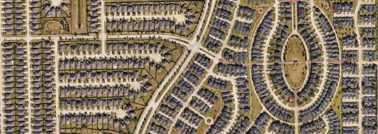
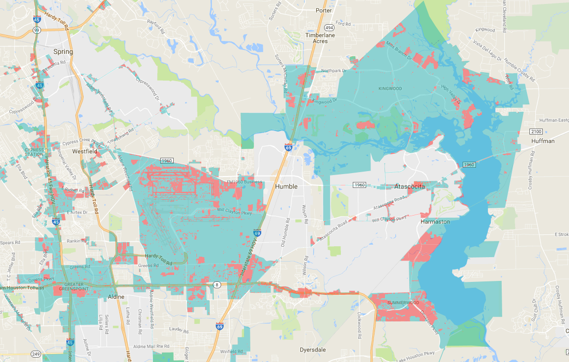
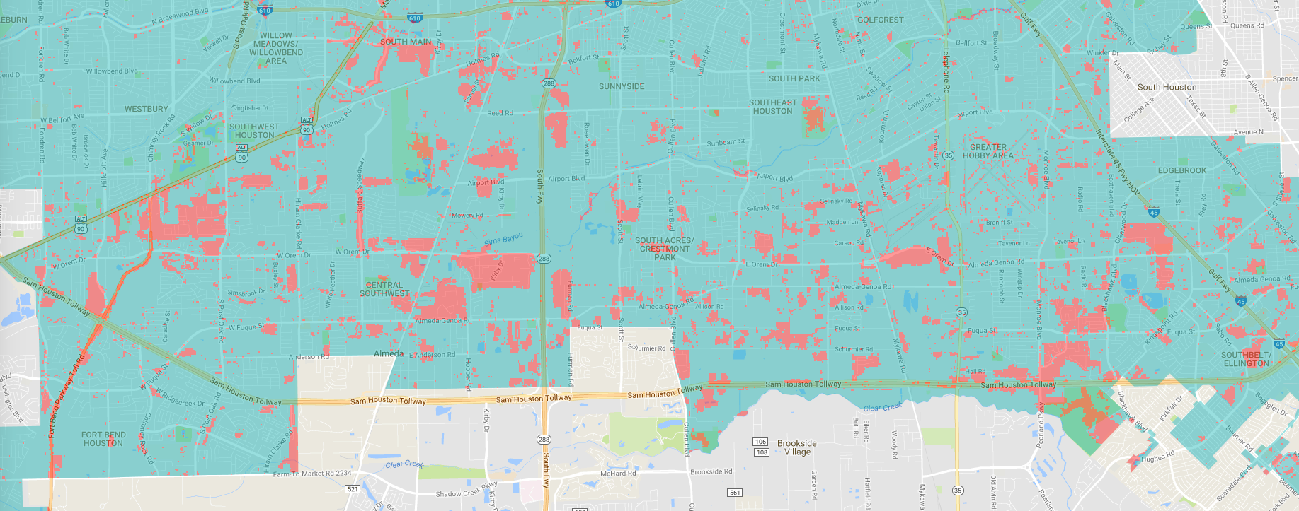
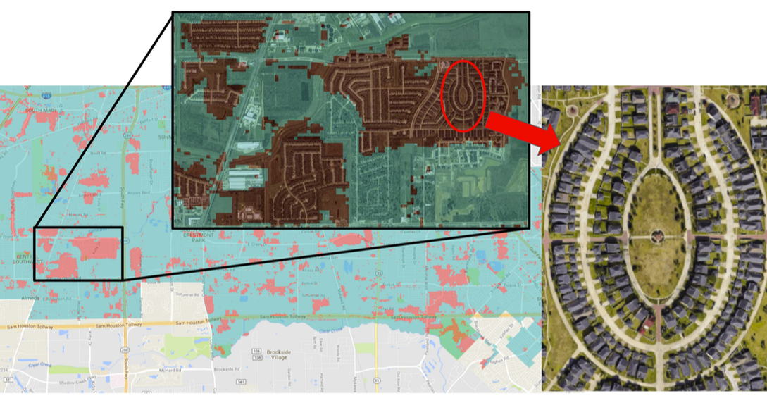
The National Land Cover Dataset is a remote sensed product released in 2001, 2006, and 2011. (The 2016 data should be released soon-ish.) Basically, a satellite flies over the US and measures the wavelengths of energy reflecting off the surface of the earth. Each type of land cover has a specific spectral signature allowing scientists to infer what is on the ground with surprisingly high accuracy - greater than 90% in most cases. Each 30 meter by 30 meter pixel of data is analyzed and assigned a dominant land cover type. The land cover types are divided up into 20 different categories and a pixel is assigned the land cover type that has the highest percentage of cover. Why should I care about the NLCD? In broad strokes, this means we can look at paved versus unpaved areas, which are really interesting to climate scientists. Most pavement and concrete store heat very effectively meaning that cities are warmer at night than the surrounding sub-urban and rural areas. This also leads to higher temperatures in cities called the urban heat island effect. Pavement and concrete and house also block rainfall from entering the soil. This leads to increased urban runoff and higher peak water flows. That's flooding. A third great use for the NLCD is for tracking deforestation. This is an amazing map from Hansen at the University of Maryland that quantifies 21st century deforestation using remote sensed data. How can I access the NLCD? The steps below access the NLCD using an internet based Google viewer called Earth Engine. (Alternately, you can download the data and use a free software program called QGIS to view it and export maps.) 1) Go to https://earthengine.google.com/ 2) Under Ready-to-Use Datasets click on Explore Datasets 3) At the top, click on Geophysical 4) Under Land Cover, click on Search landcover data in Earth Engine 5) Click on NLCD: USGS National Land Cover Database 6) Click Open in Workspace 7) Click Cancel 8) In a separate window, open the legend - https://www.mrlc.gov/nlcd11_leg.php I was fortunate enough to dodge major flooding events when I lived in Houston, but in the still-unfolding tragedy, calling Harvey Houston's Katrina seems more fitting. I heard today a report on Marketplace with Kai Ryssdal an interview with Neena Satija, a reporter for the Texas Tribune. She specifically mentioned the explosion in development that Houston has experienced recently and it got me wondering what the actual number is. How many square miles of new impervious surface have gone up recently? The best I could do is to calculate the increase from 2001 to 2011 using the National Land Cover Databse. In that single decade, 112.88 square km or 43.58 square miles of impervious surfaces were created. This number is staggering. It represents 6.87% of Houston's current land area of 1642 square km. A description of my methods are below. 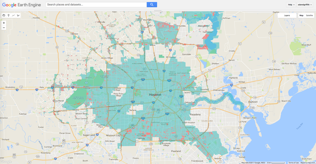 Overview: The image above shows the Houston city limits in blue-green and development built between 2001 and 2011 in orange. The development shown here is greater than 50% impervious surfaces. North Houston: The above image highlights large new housing development along the shores of Lake Houston on the right. The new runway and construction at Bush Intercontinental Airport is visible just left of center. South Houston: A patchwork of new development between the Sam Houston Tollway (8) and I-610. The larger patches are large housing developments built between 2001 and 2011. Methods:
To answer this question, I used the National Land Cover Database, a 30 meter resolution dataset produced every 5 years. I used Google Earth Engine's code editor to crunch the land cover numbers. For the Houston city limits, I downloaded the shapefile from the City of Houston OpenData portal and converted it to a public Google FusionTable using shpescape.com. I calculated area of pixels with a permeability threshhold of less than 50% for 2001 and 2011 and subtracted. Permeability of less than 50% is the same as greater than 50% impermeable. Link to code for those with access to Google Earth Engine Link to code on GitHub Limitations: These calculations do not include independent cities within the Houston City limits such as Bellaire. Sadly, the 2016 data are unavailable and calculations from 2001 to 2011 are the best numbers immediately available. I will re-run the analysis when the 2016 data are available. Some areas that are not developed appear to be developed due to the spectral signature reflected to the sensor. Conversely, some areas that are shown as impermeable may not be. This peer reviewed study shows the NLCD classification accuracy around 79%. This study from Roanoke, VA shows the NLCD impervious surface accuracy to be around 70%. I struggle with maintaining a positive attitude about what we have done to our planet. I struggle to think about the climate refugees in Bangladesh that are fleeing the rising water, the wars for drinking water, and starvation caused by droughts. On a daily basis, I think about our garden and if we are on target with the right plants in the ground with changing climate zones. I obsess over the dark metal roof I picked out for aesthetics instead of a white one that wouldn't heat up as much. I research lightweight green roof soils and fantasize about a randomized complete block design to see which sedum species and soil particle size and bulk density combinations would do best on our south facing roof real estate. We could ameliorate the urban heat island effect with some nice flat, lightweight, planters up there. We can fix this. I find myself researching germination rates of sedum mixes. And then I realize I haven't done any work for 22 minutes and I go back to grading the lab reports of my students.
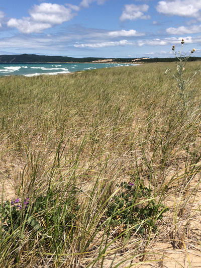
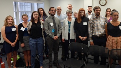
To see exactly how bad the warming is, I go to NOAA's website for the current information. I found their awesome site where you can graph temperature patterns over time and see the departure from normal. Probably the most intriguing and upsetting page was the analysis of last month, March of 2016. One paragraph stood out in particular. Read it carefully. I have pasted it below and cited it afterwards. The combined average temperature over global land and ocean surfaces for March 2016 was the highest for this month in the 1880–2016 record, at 1.22°C (2.20°F) above the 20th century average of 12.7°C (54.9°F). This surpassed the previous record set in 2015 by 0.32°C / (0.58°F), and marks the highest monthly temperature departure among all 1,635 months on record, surpassing the previous all-time record set just last month by 0.01°C (0.02°F). Overall, the nine highest monthly temperature departures in the record have all occurred in the past nine months. March 2016 also marks the 11th consecutive month a monthly global temperature record has been broken, the longest such streak in NOAA's 137 years of record keeping. From: http://www.ncdc.noaa.gov/sotc/global/201603#temp Wow. The past nine months have had the 9 highest departures from normal and March was the 11th month in a row that was have broken a high temperature record. This is terrifying. I view it as irreversible and it is on the scale of a generation or two. I compare climate change with an old friend that you see periodically that needs a hip replacement. You first detect a slight limp. A few years later, it's worse. But after 7 years, they are really walking funny. After a decade, you can spot their awkward gait from a quarter mile away. But they don't think it's as bad because it has been so gradual. I am afraid this is what it will be like. Will we be aware that it is happening? It's only a little warmer. Today was such a nice day. Maybe 80 in April is ok? But it isn't for the plants. With regard to species composition, will we be able to comprehend the meaning of the loss of an individual organism? My favorite old oak tree might not make it. I would certainly be sad. What about a whole grove of trees though? What about when all the trees in Savannah die? That would surely generate some fear. Eventually some species would go locally extinct (extirpated). I don't have any conclusion here though. I fast forward to the future. I see myself as an old man stumbling out of my underground house onto a post-apocalyptic landscape blinking awkwardly into the sun. I need to collect some rainwater, but it's really hard to carry the rain bucket with this bum hip I've got. Maybe I can do some stretches and loosen it up though... I had an amazing summer as an intern with the National Parks Service affording me opportunities to work with top-notch scientists in the USGS and NPS alike. Two highlights from the summer were a trip to Sleeping Bear Dunes National Park and conference in DC where I was fortunate enough to meet Secretary of the Interior Sally Jewell. Below are three of my favorite photos from the summer.
The first shows the federally threatened pitcher’s thistle (Cirsium pitcher) at Sleeping Bear. The second shows Marine One making practice flights while the President was on Martha’s Vineyard. The last photo shows NPS interns with Secretary Jewell. I am proud to be selected as one of 12 interns nationally for the National Park Service's Young Leaders in Climate Change. I just finished my second week at Indiana Dunes National Lakeshore where I am working with USGS scientists on developing a model to estimate ecosystem resilience to climate change.
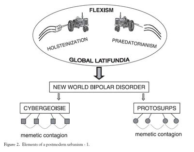
"Holsteinization is the process of monoculturing people as consumers so as to facilitate the harvesting of desires, including the decomposition of communities into isolated family units and individuals in order to supplant social networks of mutual support with consumersheds of dependent customers."
- Dear and Flutsy, 1998 This has been my favorite quote of all of my readings during my Ph.D. studies. I can think of nothing that so eloquently articulates capitalism in the 21st C. Dear and Flutsy wrote an article entitled Postmodern Urbanism and are describing a radical departure from the Chicago School (concentric zones of activity). Contrast your concept of urbanism in Chicago with that of Los Angeles. I am grateful to Dr. Harry Campbell for bring this work to our attention. Data visualizations have reached epic proportions and we now have the computing power to create things that we don't have the mental power to understand. Below is one of my favorites. Also check out http://bikes.oobrien.com and www.flightaware.com if you haven't played with them. With the holidays over, I am back to the grind. I immensely enjoyed the Christmas break, but am excited to be back in school. With the help of classmate Alexander Hohl, I am pleased to announce the beta release of beachsandmining.com - a website devoted to the documentation of the systematic destruction of beaches around the world. Check it out here!
This was my last project at Western Carolina University before I started my Ph.D. program at UNC - Charlotte in geography. If you don't want to read it, I'll summarize my findings here: recently nourished beaches did protect NJ homes more than non-nourished beaches or beaches that were nourished more than 10 years ago... but not much. And it's still insanely expensive.
|
ideasinteresting tidbits from my geography classes and academic life Archives
June 2018
|

 RSS Feed
